It's about a little boy who gets asked to babysit his friend's fish... and then he spends the entire book worrying that he won't be good enough, finally he talks himself into doing it, ... then his friend shows up with a surprise. Pages 6 and 7 are an opening spread, where the set up of the story is happening, Sophie asks Jake to babysit her fish.
The first sketch I settled on was this:
The opening refers to Jake's friend "from school", so I thought I needed to show a school yard. Jim's comments after seeing this sketch were to keep the background kind of faded back, blurry, like an out of focus lens. He also recommended making the fish have a little more personality
After turning in this sketch I decided I didn't like Sophie's pose. I thought she needed to be a little more engaged with Jake. so I changed it to this:
Jim approved of the change so I did the final like this. Notice I also added some oomph to our fishy friend:
During the critique Jim liked the expressions and interactions of the characters but thought I should drop back the shadows on the ground and downplay the contrast between the school and the bush. He also liked how I had tried the funky wave shape flowing onto the right hand page... but in the end thought it was unnecessary to move the story forward. He recommended losing the blue frame of the swing set on the right. Since Jim graciously allowed us to resubmit our edited pieces to him I spent some time redoing from his comments.
First I tried editing my original idea with Jim's comments:
I screened back the shadows and contrast of background bush and building. I added a pattern to the school to give it a little depth.....
I screened back the shadows and contrast of background bush and building. I added a pattern to the school to give it a little depth.....
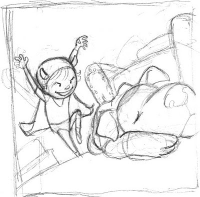
But at this point, the school building and the bush were really getting on my nerves.... not to mention I also thought i could make the kids angle a little more interesting still. So I did this sketch:
I polished it up to this:
Printed it and hung it over my drawing table so I could keep an eye on the contrast and painted this:
Then I added it into a spread:
I kept the contrast in the shadows dialed back and eliminated the wave shape on the right side. I added type to this one, placed in a way to accentuate the white space around Jake on the right, he only barely is on the paper here which foreshadows how unprepared he will feel as the story unfolds.
From multiple sketches to more than one finished image, I kept trying to turn this spread, with little action, into an ever more interesting section of the book. During the workshop, Jim said he always likes it when an illustrator takes his comments, goes away, and comes back with an even better idea. I hope I've done that here.


